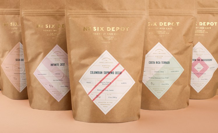
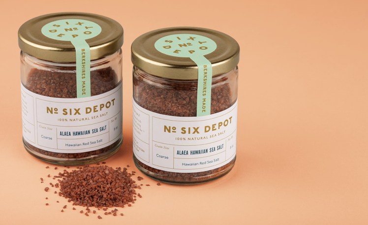
I hadn’t heard of No. Six Depot Roastery until I was gifted a bag of their Berkshire Sky Blend. The coffee sat on my pantry shelf for weeks because it was so beautiful that I didn’t want to use it. This weekend, when we finally opened the bag and brewed a pot, I decided to take a look at their website.
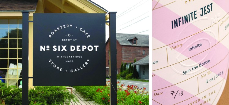
Located in the Berkshires, No. Six Depot is a small batch coffee roaster, cafe, art gallery and event space in one. Located in an old railroad station on Depot Street, it seems like a wonderful community space. Their guiding motto is “keep it simple and make it true.”
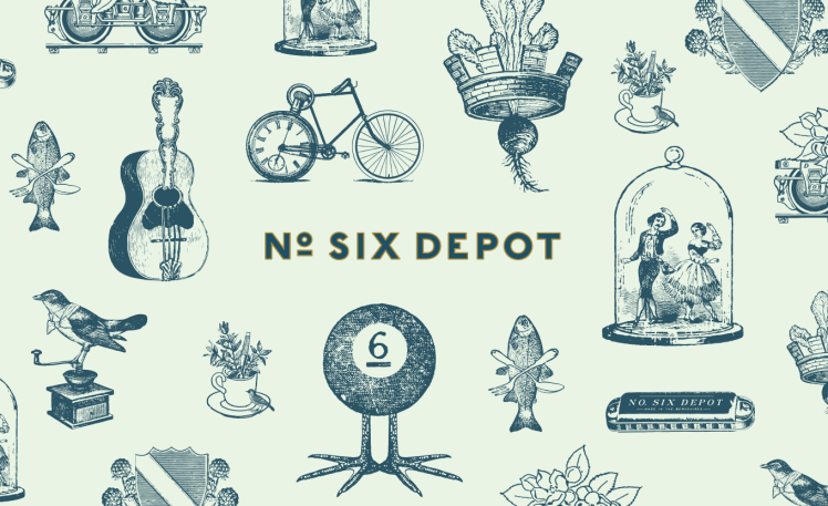
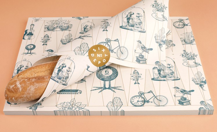
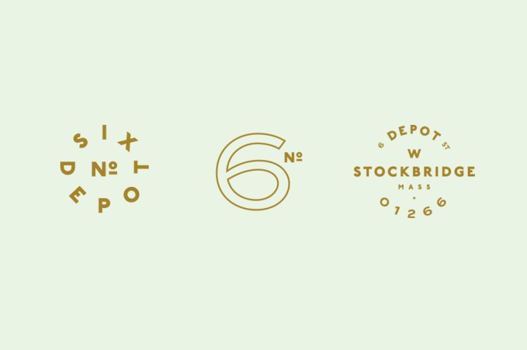
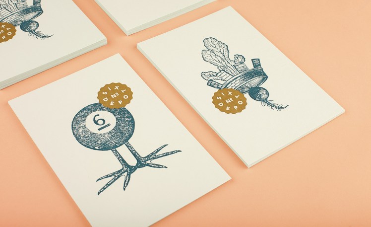
It’s no surprise then that their branding beautifully exemplifies their motto and their unique personality. Done by Perky Bros, based in Nashville, TN, “their identity juxtaposes a mix of unique rural and modern elements — drawing inspiration from their own backyard railroad.”
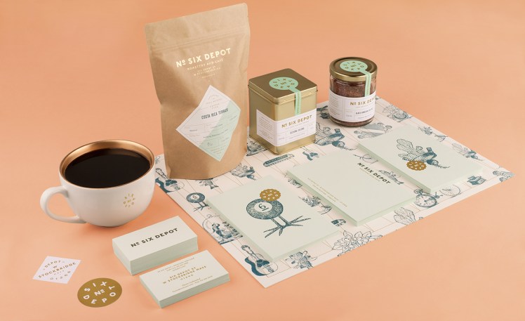
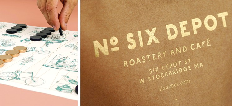
The illustration is perfectly playful and all of the elements are stunning, right down to the the backgammon placemats.
Now, all that’s left to do is plan a trip to West Stockbridge to pay them a visit!
All photos by Jennifer May Photography.
Branding by Perky Bros.
